This post aims to look at various solutions to a seemingly simple layout change.
With DevExpress XAF, a lot of the difficult things are easy: authentication, authorisation, ORM, reporting, complex form layouts, themes, etc., are all made easy by XAF. On the other hand, some of the easy things are hard. It can be frustratingly difficult to make a small modification to the basic layout. We will look at an example of such a change and evaluate the recommended DevExpress approaches.
The problem
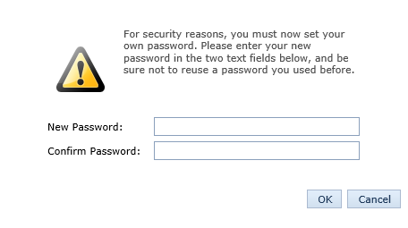
Whenever my XAF web application asks me to change my password, I get a screen like this:

Well that’s a bit annoying - those edit boxes are far too wide. Wouldn’t it look much better if it were narrower and centered? If we weren’t using XAF, we’d probably have a separate aspx file for this view and we could just modify the html. With XAF there are several different recommended ways of modifying the output.
Option 1: Use the model
Well, one approach would be to use the layout designer to add some EmptySpaceItems to the default layout for the ChangePasswordOnLogon. Add something like this to MainDemo.Web/Model.xafml:
1 2 3 4 5 6 7 8 9 10 11 12 13 14 15 16 17 18 19 20 21 22 23 | |
Ugh. What a lot of work for such a small change. Another approach would be to make an equivalent model modification in code by subclassing ModelNodesGeneratorUpdater<ModelViewsNodesGenerator> but it would be even more effort.
Is it easy to maintain? Not especially. If we make any changes to the parameters object, we would have to update the layout again. It is quite likely we’d have to make revisions when upgrading the framework.
And does it work?

No!. It’s a little better but it still looks ugly because the OK and Cancel buttons are still out wide.
Verdict: too ugly
When should you use this approach?:
- When the layout changes are within the main view area.
Let’s look at another option.
Option 2: Customise the ASP.NET template
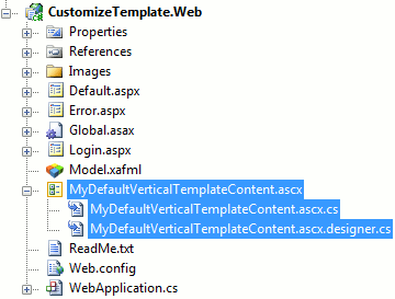
If we were to follow the instructions here we can modify the HTML exactly as we want. Unfortunately, this is even more work. We would need to:

- Create a new MyNarrowTemplateDialogContent.ascx
- Modify the HTML within it to add a width to
Form1 - Find some way of applying this template to only the detail view for Change Password. This is currently not easy but there is an example project at the end of this issue.
We’d end up with quite a few new files to maintain for just one little layout fix…
Also, another problem with this approach is that it needs reviewing whenever a new version of the framework is released, because the default templates may have changed. Too much maintenance work for such a little change.
Verdict: too heavy
When should you use this approach?:
- When the same layout changes are to be applied to the views of all or many different object types.
- When the changes you are making are significant enough that they are hard to achieve by the solution below.
Option 3: Use a ViewController
The ViewController and WindowController are well-suited to this sort of task.
1 2 3 4 5 6 7 8 9 10 11 12 13 14 15 16 17 18 19 20 21 22 23 24 25 | |
A side note: do not use TargetObjectType == typeof(ChangePasswordOnLogonParameters) instead of the OnActivated() override. This is because ChangePasswordParameters which is used when the user clicks on Change My Password is a subclass of ChangePasswordOnLogonParameters and we do not want that view to be narrowed because it appears in a popup window instead of the main window.
This solution is quite maintainable. We can delimit the views for which the modification applies making the controller is active. And the modification itself is relatively simple. It is also reasonably robust with regard to DevExpress upgrades. (They did just change the name of the main dialog Form Form1 in 12.1 to Form2 in 12.2, but it was the first time in years and it was simple to fix. Alternatively, you could use FindControl instead of using the hard-wired name).
Here’s the resulting output, horizontally centered in the browser window:

Verdict: good
When should you use this approach?:
- When a layout change is easy to apply by modifying styles. When a change pertains only to one or few specific object types.
Conclusions
In this case, using a ViewController leads to relatively simple code and ease of maintenance. Other situations may well be better served by the other approaches.
DevExpress XAF is a powerful mature product. As such, it can be daunting to new users because of all the different approaches for applying changes. It is always possible to find an elegant maintainable solution, but sometimes it is not obvious, even when the required change is small.